Identifying a
UX problem.
User Research & User Design
overview
As a student at RMIT I was tasked to identify and shape a problem relevant to user experience, such as a frustrating website or app, a user flow issue. I opted to investigate the Sonos S2 app.
Sonos is a high-end wireless audio sound system. The founders goal was to create a wireless sound system that would work in any room in the house and could be accessed via PC (Personal Computer). Today the system is controlled by the Sonos s2 platform which enables you to control your system and integrate 3rd party streaming services. My hunch was around the user flow experience with navigating to desired services and speaker control.
role
Sole UX researcher and designer. I was responsible for:
User research and synthesis, ideation, low and medium fidelity prototypes, user testing and future recommendations.

project duration
4 weeks - Commencing December 2022
tools
Figma, Marvel and Miro
disclaimer
This project is a student project designed to explore product user flow issues. The design and ideation are those produced from myself and not in affiliation with Sonos Pty Ltd.
The process.
Double
Diamond Framework.
I employed the double diamond framework for the project, identifying the problem and working through a convergent and divergent iterative process to arrive at a solution. This framework ensures the designs are created to the full context of the problem space.
The problem.
hunch
My
A preliminary hunch was formed in the research and discovery phase around potential user flow issues with the mobile platform. I wrote a statement detailing any user flow hunches that may be causing user frustration with the Sonos app, and how we make improvements to create a better user experience.
Understanding the problem - The Sonos system is reliant on its platform to operate its system, the business is built upon a marriage between innovative hardware and the effortless usability of their digital platform. The majority of Sonos’s revenue is driven from hardware sales with revenue also generated from 3rd party streaming services and the ‘Sonos radio’ subscription model.
Today the wireless speaker market is competitive space and Sonos the pioneers of the technology, once possessed a strong unique value proposition (UVP), must work for their share of the wallet creating a seamless user experience.
discover
Sonos users might find it difficult to find the music source they are after because the
navigation is confusing
Sonos users may find it difficult to link areas because they don't understand how to pair
speakers
Sonos users find it difficult to achieve set out task because it lacks signifiers and intuitive
design
Desktop research.
Gathering data via desktop research helps me to further define any problems that may exist and validate my hunches.
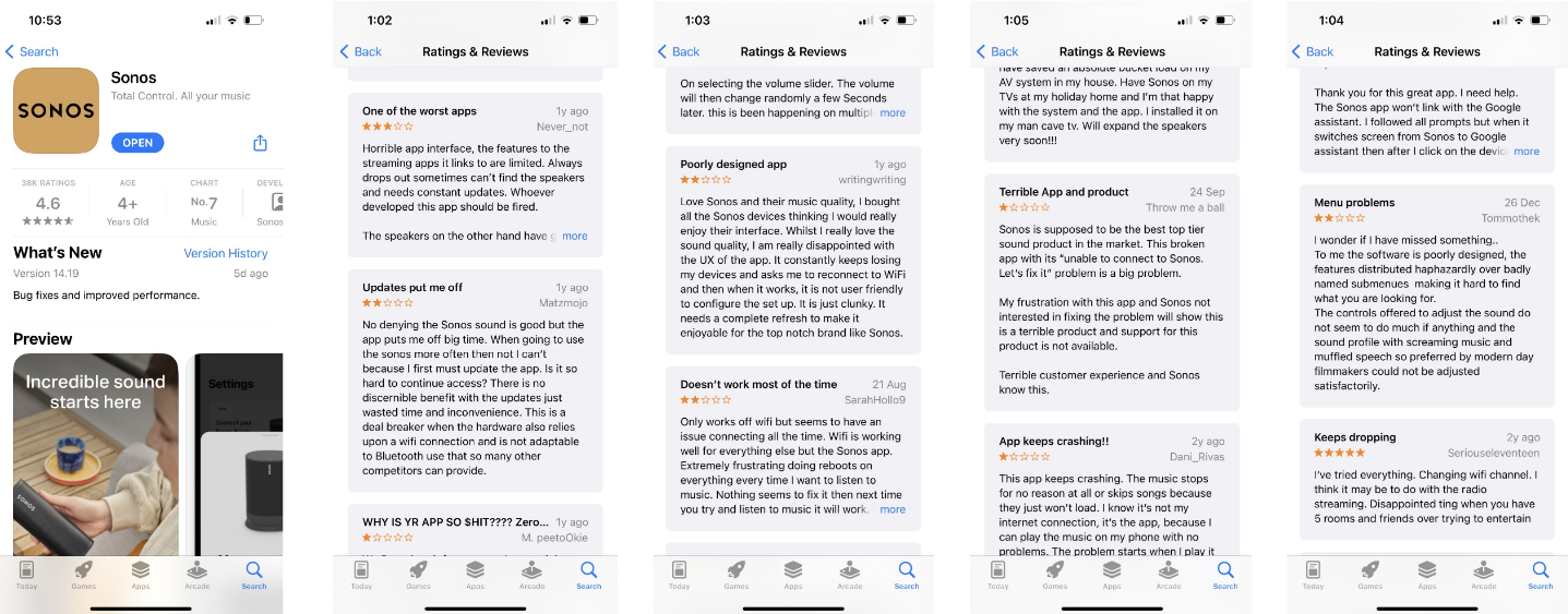
I look at user reviews through Apple's App store to gain customer insight on usability. The ratings and feedback were related to app functionality and usability and interaction with the actual hardware.
It was a small sample size, but the key takeaway here is that the user feedback reflects the usability and flow issues highlighted in my hunch problem statements.
Research approach.
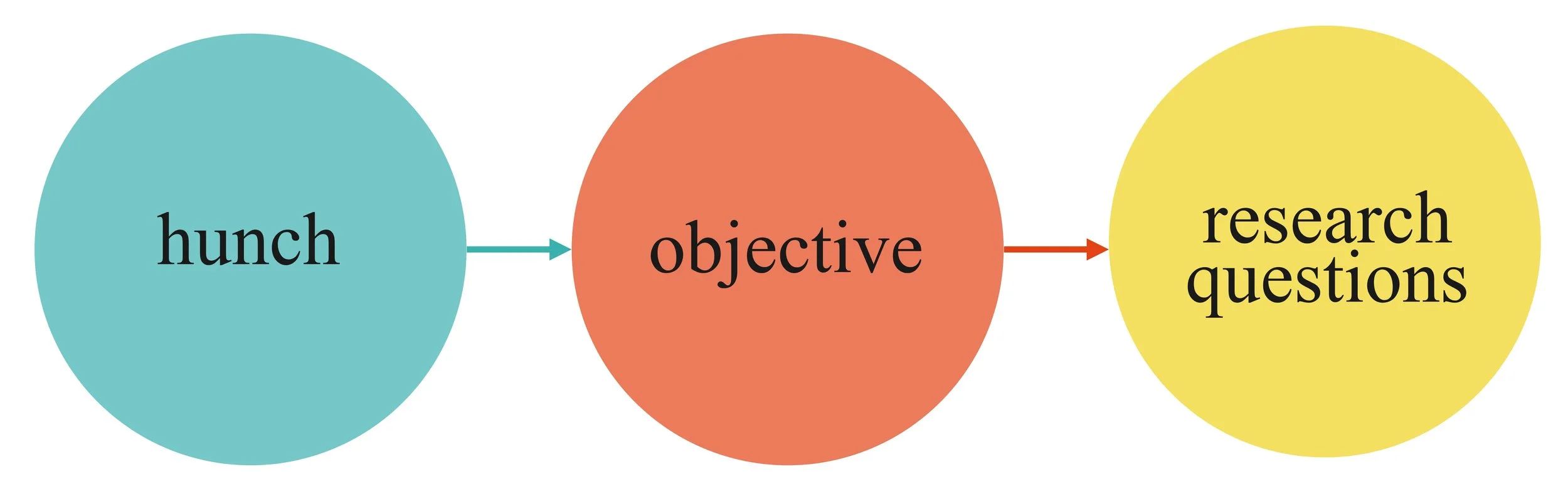
Having received adequate problem validation from the desktop research phase, I now wanted to talk to real users that sat within the range of our target customer personas.
Taking the revised hunches and defining some research objectives allowed me to form interview questions, taking an unbiased approach to really understand the people and their needs.
objective #1
To understand how users select music and identify any issues with the experience
objective #2
Understand what a users main objective is using the app and how they go about achieving this and if there are any issues with the user experience
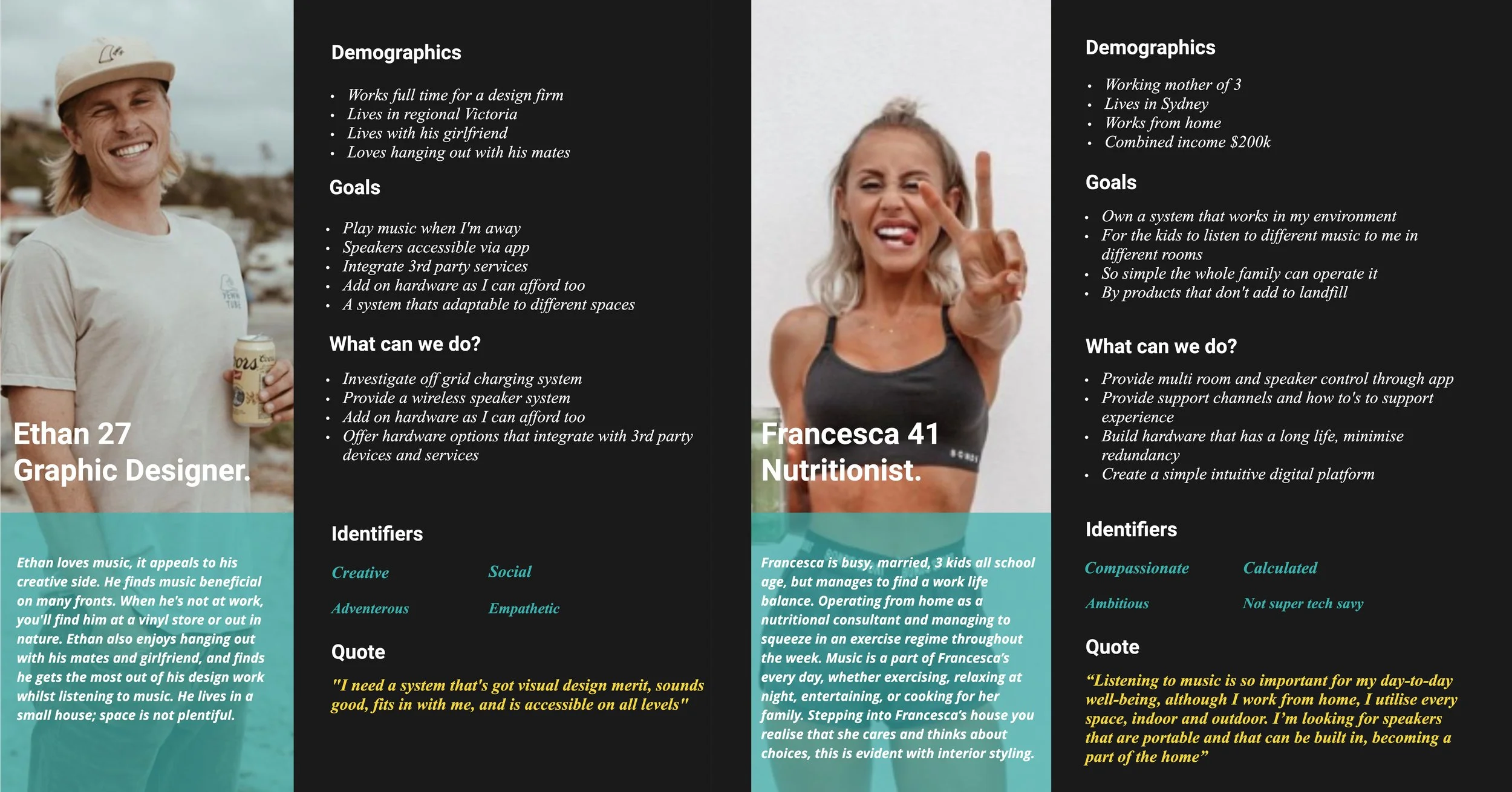
Target personas.
To understand the customers, I outlined two common and ideal proto personas who typically share the goals needs and behaviours of our customer base. For the user interviews to be conducted, my goal was to recruit participants that meet the archetypical user and therefore have similar user needs. In the real world the personas would require validation through research.
UX research.
interviews.
Based on the initial quantitative research and validation of my initial hunches and assumptions, the next step was to take a qualitative approach recruiting and interviewing participants inline with my proto-personas and explore the problem space further.
The interviews were recorded and questions constructed to achieve Objectives #1 and #2. Still in the discovery and definition phase of the Double Diamond framework the insights from the interviews will allow me to synthesise and converge on solutions for ideation.
Synthesis.
affinity mapping
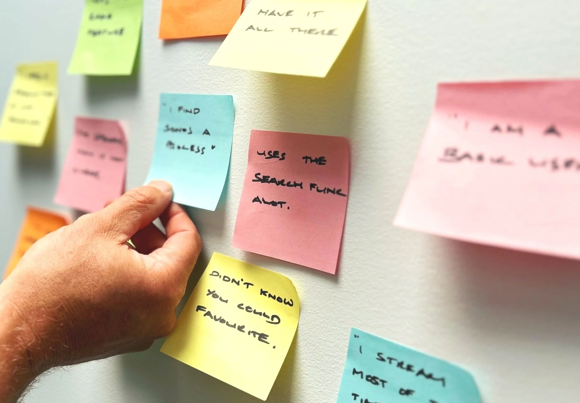
The interviews generated some interesting insights. To uncover these insights, I needed to analyse all of the captured data and understand “why” and “what” it means. Using an affinity mapping I could group the insights into themes.
The main problem I uncovered, and the general problem was the usability was just “not simple and clear” enough. Participants were also unaware of some of the features offered by Sonos. The whole Sonos model is based on utilising the Sonos hardware via the digital platform, so it’s important that the customers understand how use the platform.
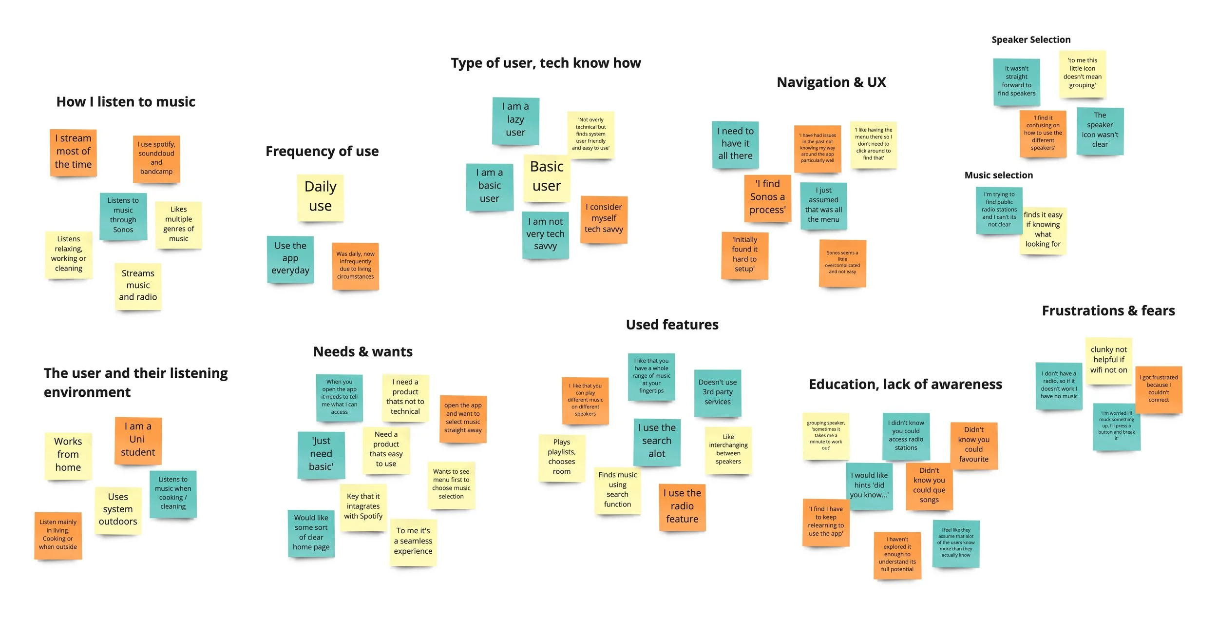
key takeaways
Participants felt they had to “re-learn” the navigation in the app every time they used it.
Trying to navigate to desired music is “confusing”
Lack of education and awareness to what the Sonos platform has to offer
Finding and utilising the speakers is “not straight forward”
Ideation.
storyboarding
Together with the insights I wanted to look through the lense of the customer by looking at their journey through storyboarding prior to sketching out low fidelity ideas. This places me in the customers shoes and a real world environment and application.

user flow.
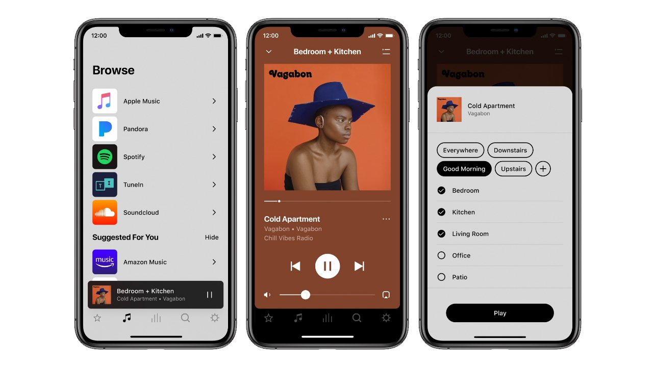
The insights have indicated that the majority of the user flow issues surround navigation music, speaker selection and the first screen. The objective is to simplify and streamline the experience. I put together a basic user flow diagram of the current experience to highlight some of the current potential issues.
User Goal: To connect to the system and link two speakers and change music selection.
Sense of disorientation due to navigation
Poorly named menus and sub-menus
Poor distribution of features
No home screen
“My Sonos” feels un-finished
Incomplete UI. No clear direction
Unclear navigation no supporting copy
Ideation.
Insights & recommendations
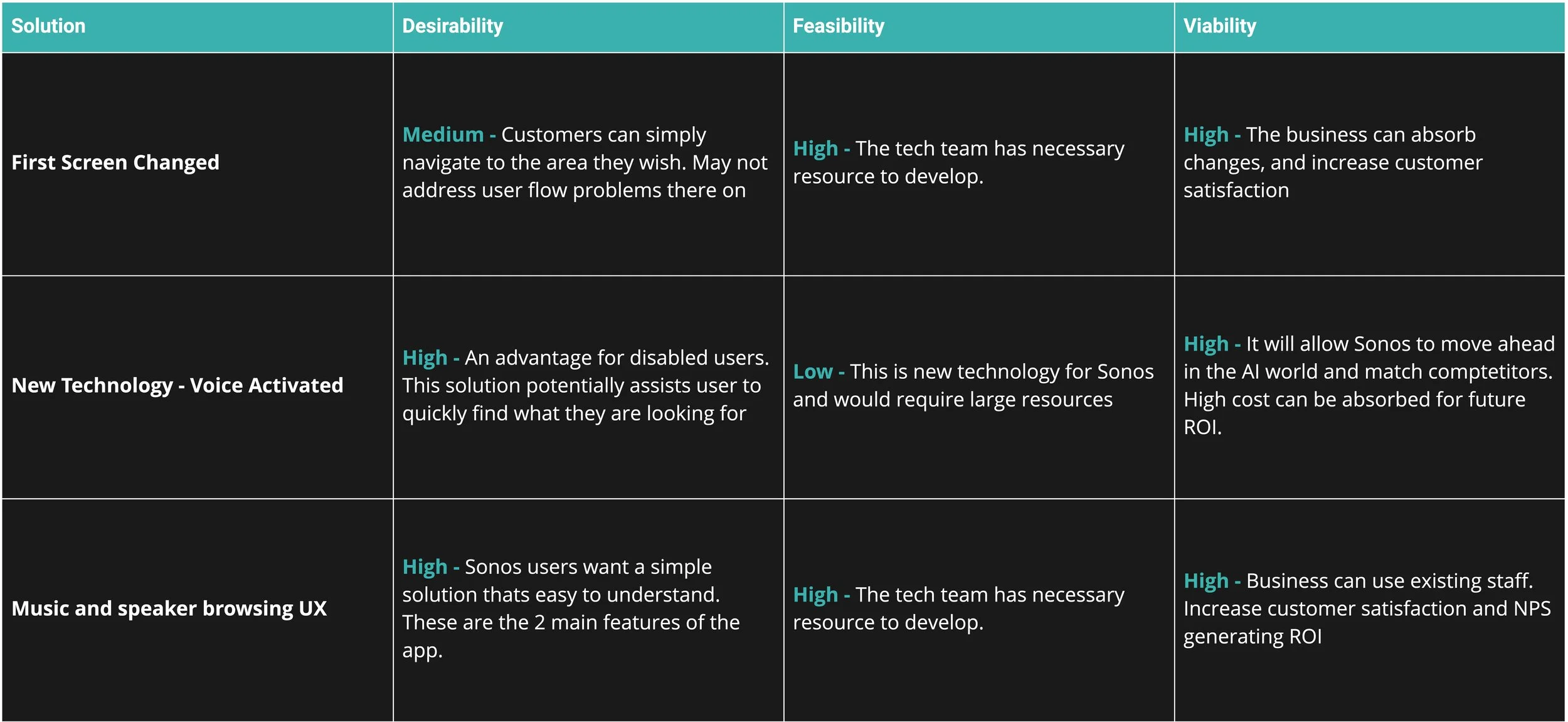
DVF framework
I kick started the solution process prior to sketching by using how might we statements to explore the problem space and evaluate solutions based on the DFV Prioritisation Framework based on Desirability, Feasibility, Viability to narrow the choice.
how might we?
Writing how might we statements helped me to further explore the problems framing insights into opportunities.
User wants to access the music services on the Sonos app because they want a selection but find it hard to locate what they want to listen too.
How might we redesign the music selection experience so that it can be simpler to find and less confusing.
User want to make the most of Sonos features because they invested in the system but are unaware of what services they can use.
How might we educate users so they can make the most of the sonos features and services.
How might we redesign the experience for users so that it's easy to understand and clear
Users love having multiple speakers, because you can listen to music in different rooms but don’t understand how to use them
Ideation.
sketching
An effective ideation sprint sketching method we use is called the ‘the crazy eights’, here I generated 8 ideas within 8 minutes, the idea being I could generate a variety of solutions to the problem. My goal here was to form a starting point to develop a low-fi prototype, producing 16 sketches I approached the interview participants and used a dot voting system to indicate which designs were resonating, this feedback helps with delivering a solution that meets users needs.
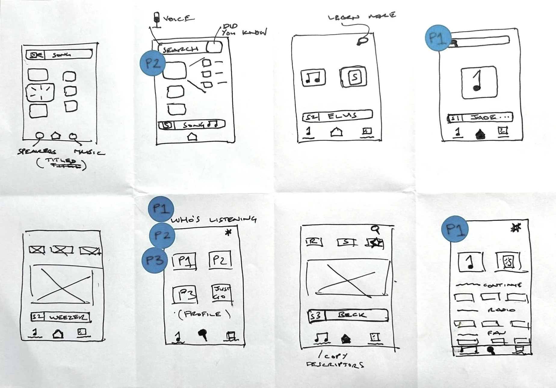
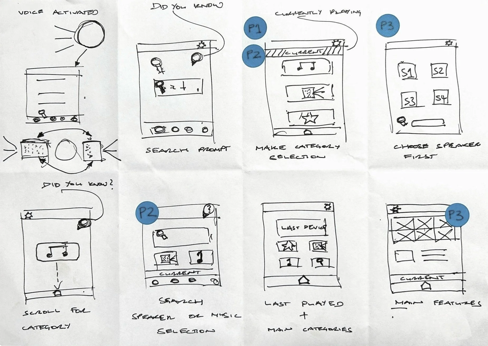
low-fidelity
prototype.
Paper Prototypes - These initial prototypes were chosen based on user feedback. They were also created in-line with the 'how might we statements' addressing the user experience concerns uncovered in the user research and based around the prioritisation selection.
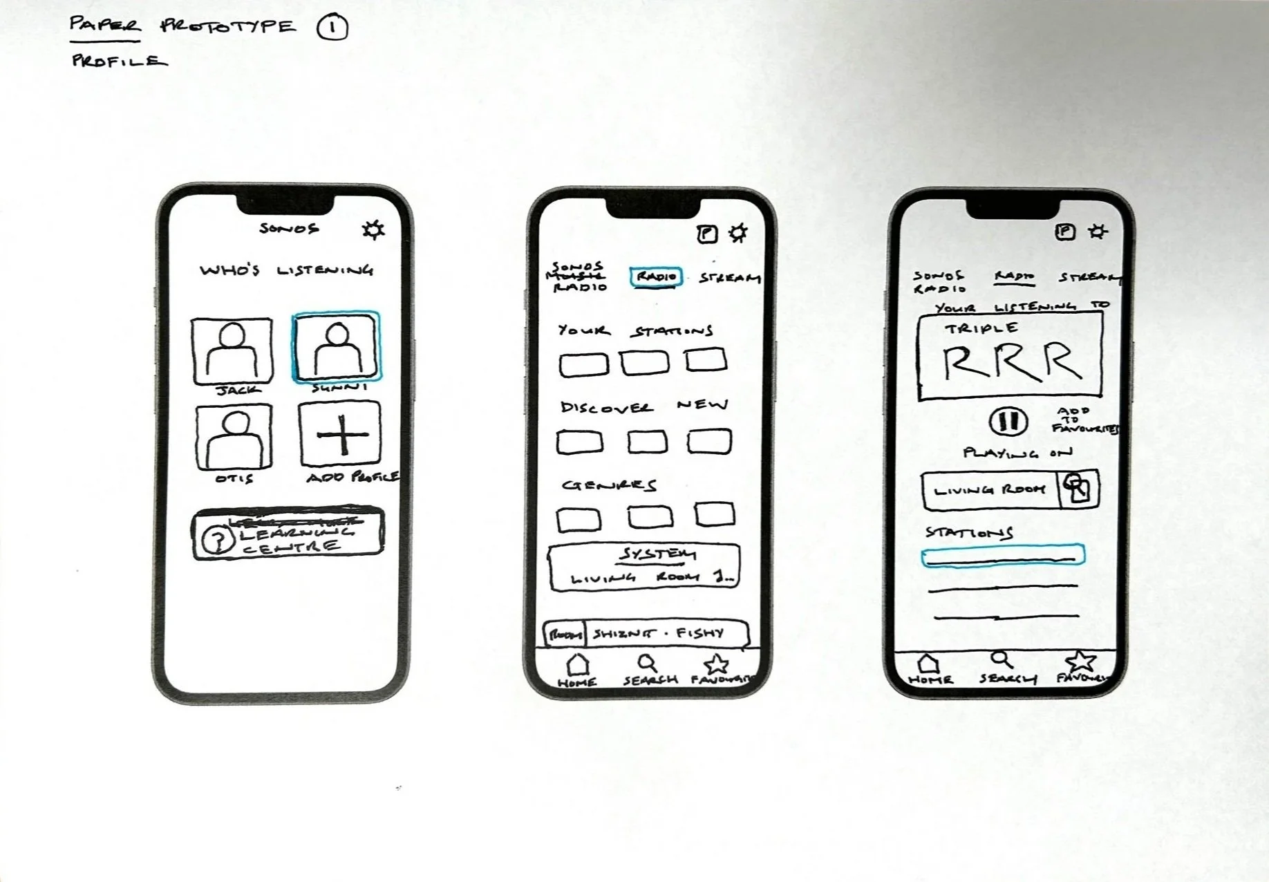
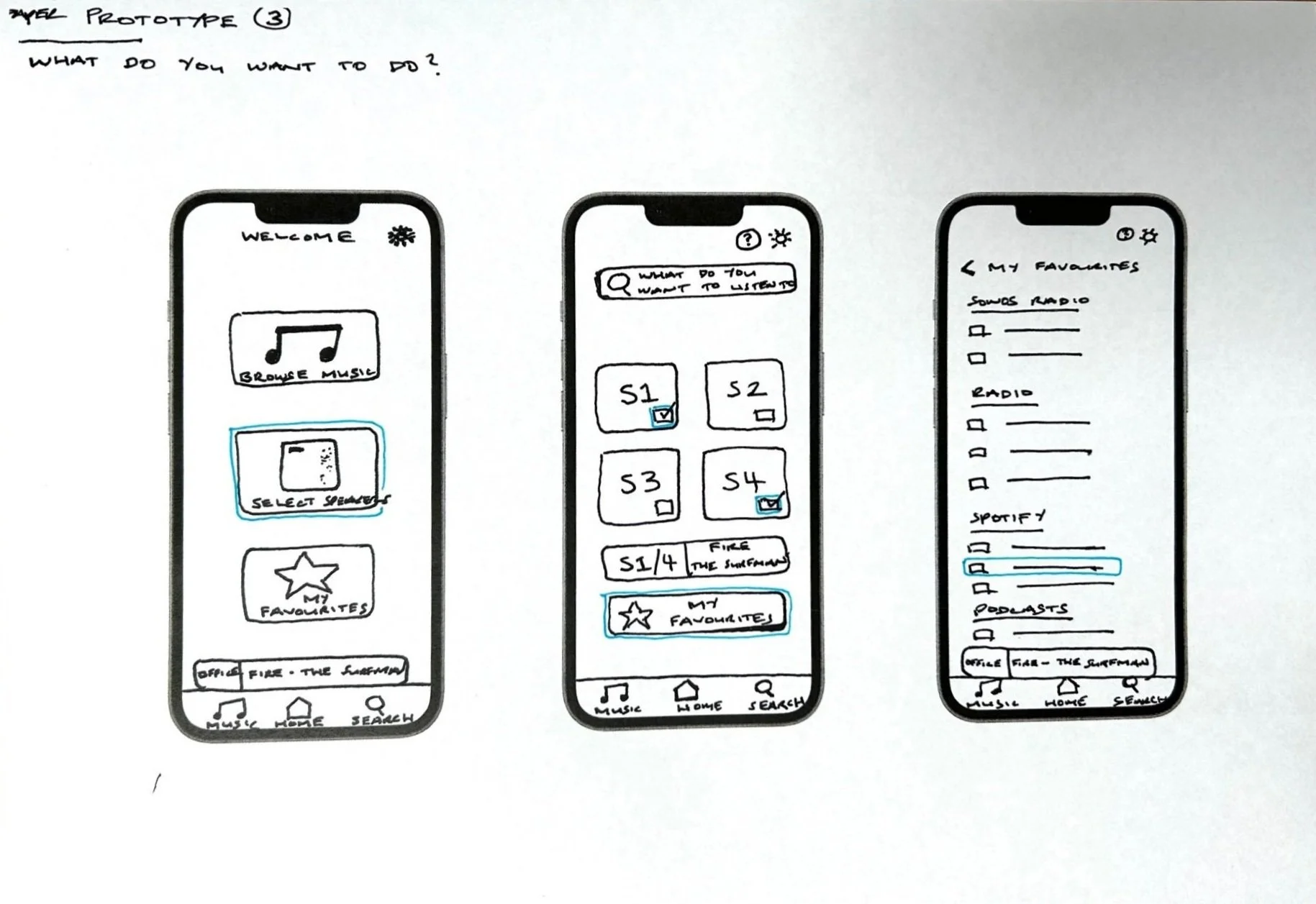
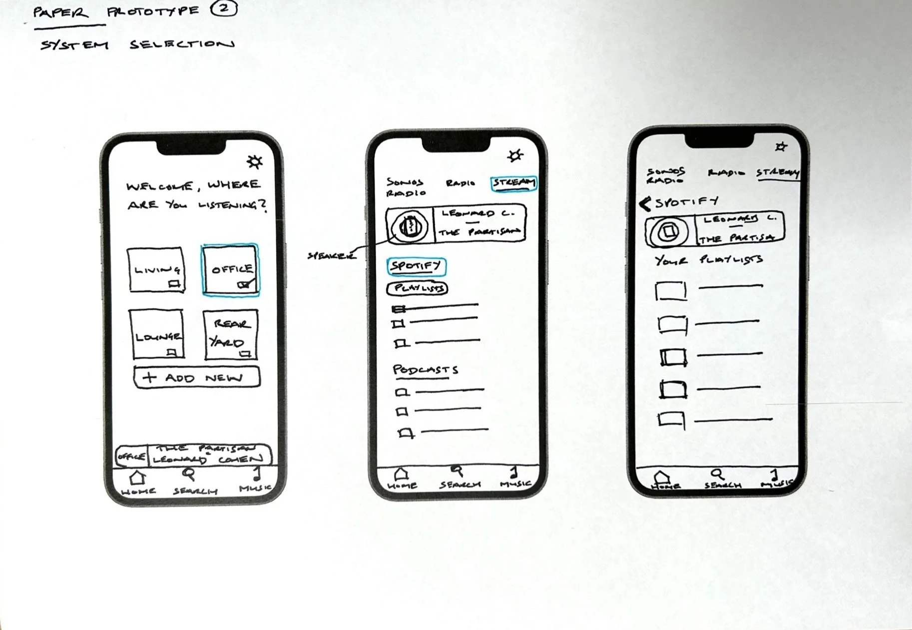
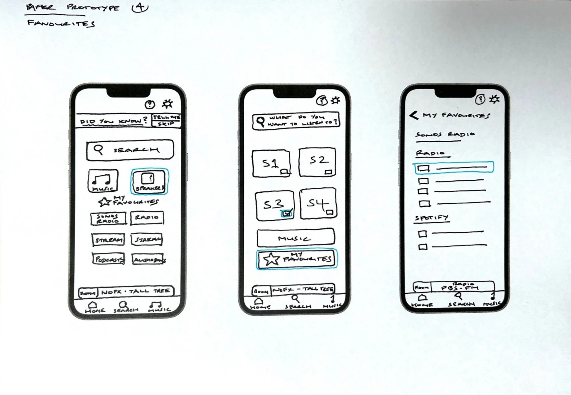


The highest voted paper prototype by participants was converted to a Lo-Fi working prototype for user testing.
User testing.
The user testing was conducted both face to face and remotely moderated. The objective was to discover what’s working and what is not so we can further iterate the prototype. The participants performed a series of tasks associated with navigating, selecting music and controlling speakers. They were asked questions in relation to these tasks. The participants also provided running commentary as they performed the tasks.
affinity mapping
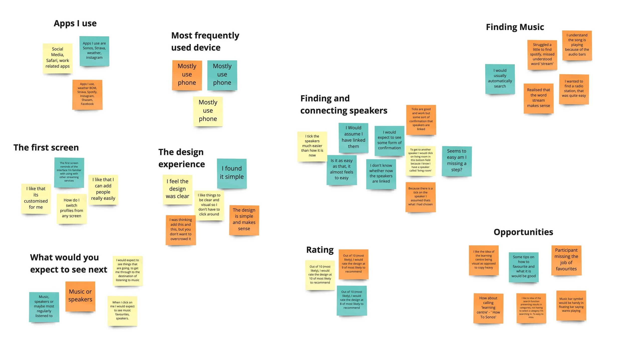
Again breaking data into themes and using affinity mapping, I was able to identify opportunity for further iteration and whether in fact the design was meeting user needs and addressing the user flow issues. The data indicated that the participants had a clearer understanding of how to complete their set out tasks.
key takeaways
Participants felt that the revised design was simple, clear and easy navigate
Participants would like further feedback of speaker selection
A learning centre providing tips and how too’s would be handy
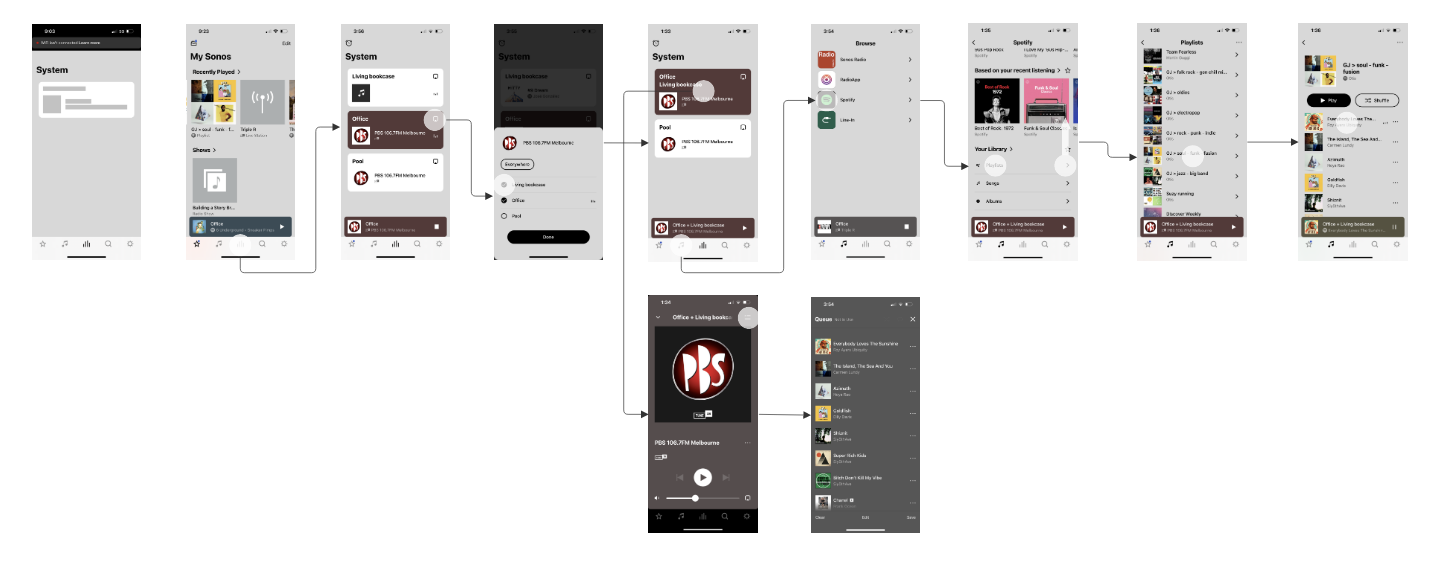
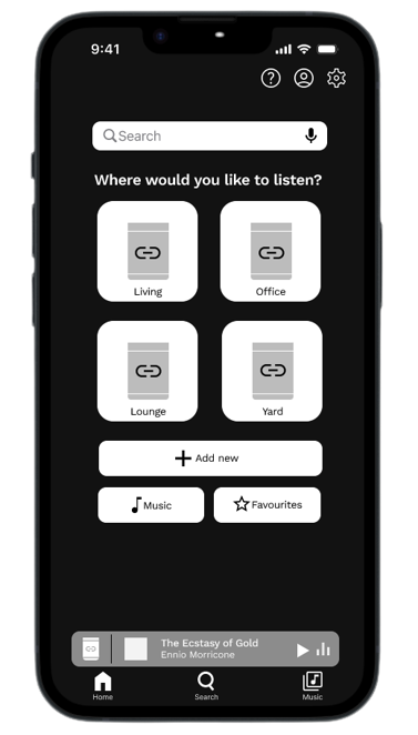
Medium-fidelity
prototype.
The goal of the prototype is to gauge user interaction, flow and understanding of the steps required to place music from different sources and control the speaker system, the desired outcome is a clear indication of whether our design intentions were successful.
Further usability testing including A/B tests will further refine the design as we would move into a high-fidelity prototype.
INSIGHTS &
RECOMMENDATIONS.
Moving forward it’s important that another usability test is conducted with the medium fidelity prototype and subsequently Hi Fidelity prototype prior to moving into development.
I would also recommend revisiting the desktop research and prioritisation feedback to explore opportunities to improve other user flow elements of the app and fix hardware and downtime issues.
We must strive to provide the best user experience and its pivotable that our digital platforms create the best user experience.